Finding a font that looks great in both Arabic and English is harder than it sounds. Most fonts do one well and completely ignore the other — leaving your design feeling unbalanced and mismatched. If you’ve ever spent hours searching for the right typeface for a bilingual project, you know exactly how frustrating that can be.
That’s exactly the problem Dubai Font was built to solve. It was designed to handle both scripts equally well, with the same care given to Arabic and Latin alike. But is it always the right choice? And how does it compare to other Arabic fonts out there? Let’s get into it.
What Is Dubai Font and Why Does It Stand Out?
Most fonts are either good at Arabic or good at Latin — rarely both. Dubai Font was built differently. It was commissioned by the Government of Dubai and designed in partnership with Microsoft and Monotype. The goal was simple: create one typeface that works beautifully in both scripts without either one feeling like an afterthought.
The result is a clean, modern, and highly readable font that’s now used by government departments, designers, brands, and everyday users all over the world. And the best part? It’s completely free.
Who Made It?
The font was designed by a six-member team led by Dr. Nadine Chahine, a specialist in Arabic type design at Monotype. She brought together her deep knowledge of Arabic calligraphy and legibility research to create something that truly works for both scripts equally.
Why Is It Free?
The Government of Dubai made it free on purpose. The vision behind it was bigger than just design — it was about promoting literacy, self-expression, and making high-quality typography accessible to everyone, not just big brands or agencies.
A Closer Look at Dubai Font Style and Design
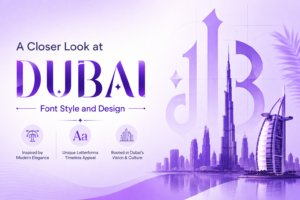
The Dubai font style is best described as modern with a traditional soul. It takes inspiration from classic Arabic calligraphy — specifically the Naskh and Muhaqqaq styles — but gives them a clean, contemporary finish. Nothing too decorative. Nothing too plain. Just a well-balanced typeface that works in a wide variety of situations.
For the Latin side, it draws from Dutch type design traditions, which gives it a solid, readable structure. Whether you’re setting a headline or a long paragraph, the font holds up well on both screen and print.
Dubai Font Family: Weights, Variants, and Use Cases
One of the biggest strengths of the dubai font family is the range it offers. You don’t just get one style — you get four different weights, each serving a different purpose.
Dubai Light Font — Clean and Minimal
The dubai light font is perfect when you want things to feel airy and open. It works great for body text, captions, or any design where you don’t want the typography to feel too heavy. Think editorial layouts, app interfaces, or minimalist branding.
Dubai Regular and Dubai Font Bold — Everyday to Impactful
Regular is your go-to for everyday use — documents, presentations, websites, anything that needs to be readable without being flashy. The dubai font bold is where things get punchy. Use it for headlines, key messages, or anywhere you need text to grab attention fast.
Dubai New Font — What’s Changed?
The dubai new font is an updated version that brings some refinements to the original design. The spacing feels tighter, the letterforms are slightly more polished, and it performs even better on digital screens. If you’re starting a fresh project, this is the version worth using.
Dubai Font Arabic vs. Other Popular Arabic Typefaces
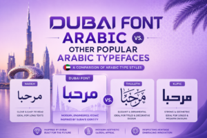
Now here’s where it gets interesting. How does Dubai font Arabic compare to other well-known Arabic typefaces like Noto Arabic, Amiri, or Cairo?
Noto Arabic is great for multilingual projects and has wide language support, but it can feel a little generic. Amiri is beautiful and traditional — ideal for books or classical content — but it doesn’t pair as naturally with Latin text. Cairo is modern and friendly, popular in digital projects, but lacks the official weight that Dubai Font carries.
What makes Dubai Font different is that Arabic Dubai font was designed from scratch with both scripts in mind at the same time. Most other Arabic fonts add Latin support as an afterthought. Here, both scripts were developed together, which makes the pairing feel natural and intentional.
Side by Side — A Quick Comparison
| Font | Arabic Quality | Latin Support | Best For |
| Dubai Font | Excellent | Excellent | Bilingual, branding, official use |
| Noto Arabic | Good | Good | Multilingual, neutral projects |
| Amiri | Excellent | Average | Classical, literary content |
| Cairo | Good | Good | Digital, casual, modern UI |
Dubai Font English — How Well Does It Work for Latin Text?
Surprisingly well. The dubai font english handles Latin characters with the same care as its Arabic counterpart. It’s clean, easy to read, and feels professional without being stiff. For bilingual designs — whether that’s a website, a poster, or a business card — this font keeps everything looking consistent across both languages. That alone makes it a very practical choice.
Dubai in Arabic Font — Cultural Meaning Behind the Design
Typography isn’t just about letters. It carries identity, culture, and feeling. The Dubai in Arabic font was specifically crafted to reflect the spirit of the city — modern and ambitious, but still rooted in tradition. It blends the heritage of classical Arabic script with the clean lines of a forward-thinking city.
For designers working on projects tied to the UAE, the Gulf region, or any Arabic-speaking audience, using this font adds a layer of cultural authenticity that generic typefaces simply can’t offer.
How Dubai City Font Became a Symbol of Modern Identity
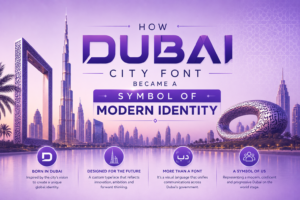
When the font launched in 2017, it wasn’t just a design release — it was a statement. The dubai city font was rolled out across government buildings, official communications, and public installations around Dubai. Giant letterforms from the typeface were even placed around the city as public art.
It quickly became more than just a font. Brands and businesses in the region rushed to adopt it. It became a symbol of belonging, modernity, and pride. That kind of cultural weight is rare for any typeface, let alone one that’s only a few years old.
How the Public Reacted
The response was genuinely enthusiastic — not just from designers, but from everyday people. Seeing large sculptural letters installed around the city made typography feel personal and exciting to an audience far beyond the design world. That’s something very few fonts have ever managed to do.
Using Dubai Logo Font in Branding and Design Projects
If you’re building a brand with any connection to Dubai, the UAE, or the wider Arab world, the Dubai logo font is worth serious consideration. It’s clean enough to work at small sizes, strong enough to hold its own in large displays, and carries that cultural credibility we just talked about.
For logo design specifically, the Bold and Medium weights tend to work best. They have enough presence to make a mark without feeling aggressive. Pair it with a simple icon or symbol and you’ve got a solid foundation for a brand identity.
Tips for Using It in Logo Design
Keep the lettering simple and let the font do the work. Avoid adding too many effects or overlays — Dubai Font already has strong character on its own. If you’re working bilingually, align the Arabic and Latin versions carefully so both feel equally weighted and balanced in the final logo.
Which Font Is Right for Your Project?
Here’s a quick way to think about it:
Choose Dubai Font if you need a bilingual Arabic and English design that feels polished, modern, and professional. It’s especially strong for anything connected to the UAE or Gulf region. It’s free, well-made, and widely supported across Microsoft tools and design software.
Choose Amiri if your project is more traditional or literary in nature — religious texts, formal documents, classical content.
Choose Cairo or Noto Arabic if you need a more neutral, globally friendly Arabic typeface with no specific regional association.
Choose a custom or premium typeface if your brand needs something completely unique that no one else is using.
Honestly, for most bilingual design projects — especially in the MENA region — Dubai Font is one of the smartest free choices you can make.
Final Thoughts
Dubai Font is not just a good free font — it’s a genuinely well-designed typeface with a strong story behind it. It handles Arabic and English with equal care, comes in multiple weights, and carries a cultural identity that most fonts simply don’t have. Like any tool, it works best in the right hands for the right project — so know what you need, understand your audience, and let that guide your choice.
And if you need help putting it all together — whether that’s a bilingual website, a brand identity, or a full digital presence — that’s exactly what we do. Get in touch today and let’s build something great together.
FAQs
What is Dubai Font and who created it?
Dubai Font is a free bilingual typeface commissioned by the Government of Dubai, designed in partnership with Microsoft and Monotype, led by Arabic type specialist Dr. Nadine Chahine.
Is Dubai Font really free to use?
Yes, it’s completely free. The Government of Dubai made it free to promote literacy, self-expression, and make quality typography accessible to everyone.
How many weights does the Dubai Font family include?
It comes in four weights — Light, Regular, Bold, and Medium — each suited for different use cases from body text to bold headlines.
How does Dubai Font compare to other Arabic fonts like Noto Arabic or Amiri?
Unlike most Arabic fonts that add Latin support as an afterthought, Dubai Font was designed for both Arabic and Latin scripts equally from the start, making it the strongest choice for bilingual projects.
Is Dubai Font good for logo and branding projects?
Yes, especially for brands connected to the UAE or Arab world. The Bold and Medium weights work best for logos — clean, professional, and culturally authentic.